Kitchen Color Ideas: 30+ Palettes for Every NJ Home Style
Color is the single most transformative element in a kitchen. You can spend six figures on cabinets, countertops, and appliances, but if the colors fight each other — or worse, drain the energy from the room — the kitchen will never feel right.
The opposite is also true. A well-chosen color palette can make a modest kitchen feel curated and intentional, a small kitchen feel spacious, and an outdated kitchen feel contemporary without replacing a single cabinet.
After over 20 years of kitchen remodeling across New Jersey, we have seen color trends come and go. Tuscan yellows, cherry cabinets, all-gray-everything, the farmhouse white explosion — every era has its palette. What stays constant is the principle: great kitchen color is about relationships between surfaces, not individual color choices.
This guide covers 30+ kitchen color palettes organized by cabinet color, home style, and design mood. Every recommendation includes specific paint colors, countertop pairings, backsplash suggestions, and hardware finishes — plus NJ-specific considerations for natural light, ceiling height, and resale value.
What this guide covers:
- 30+ complete kitchen color palettes (not just cabinet colors — full-room schemes)
- Wall color pairings for every popular cabinet color
- Countertop and backsplash color coordination
- Hardware finish recommendations for each palette
- NJ natural light considerations by window orientation
- Color palettes organized by home style (Colonial, Ranch, Shore, Modern)
- Trending color families for 2026 and what is fading
- Colors that maximize resale value in the NJ market
Planning a kitchen color scheme? Schedule a free design consultation or call (732) 984-1043. We bring physical samples to your home so you can see colors in your actual kitchen light — not a showroom.
How to Build a Kitchen Color Palette (The 60-30-10 Rule)
Before diving into specific palettes, understand the framework professional designers use.
The 60-30-10 rule divides your kitchen into three color proportions:
- 60% dominant color — cabinets and walls (the backdrop)
- 30% secondary color — countertops, backsplash, and large furniture (the supporting player)
- 10% accent color — hardware, fixtures, bar stools, and accessories (the punctuation)
This ratio prevents visual chaos. When homeowners struggle with kitchen color, it is almost always because they skipped this framework and chose each surface independently instead of as a system.
The hierarchy matters: Pick your cabinet color first (it occupies the most visual real estate), then choose countertops that complement, then backsplash that bridges the two, then wall paint that recedes, then hardware and fixtures that punctuate.
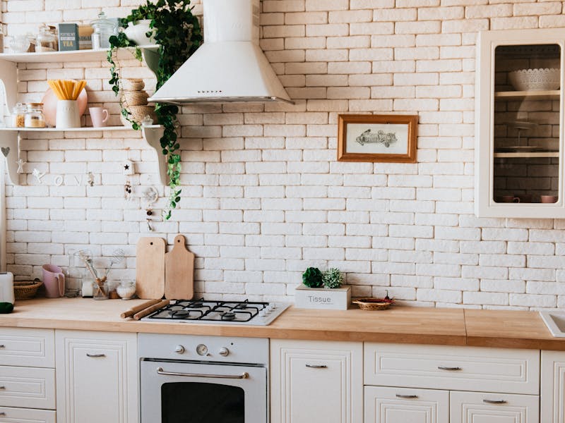
White Cabinet Kitchen Palettes (Ideas 1-6)
White cabinets remain the foundation of NJ kitchen design for good reason: they reflect light, they pair with everything, they photograph well for resale, and they never look dated the way trendy colors eventually do.
The key to a great white kitchen is choosing the RIGHT white and pairing it with enough warmth and contrast to avoid the sterile, builder-grade look.
1. Classic White + Warm Gray + Brass
The most universally appealing kitchen color palette in the NJ market. Works in every home style from Colonial to Contemporary.
The palette:
- Cabinets: Benjamin Moore White Dove (OC-17) — a warm, soft white with just enough cream to feel inviting without looking yellow
- Walls: Benjamin Moore Classic Gray (OC-23) — barely-there warm gray that adds depth without competing
- Countertops: White marble-look quartz with soft gray veining (Caesarstone Calacatta Nuvo or similar)
- Backsplash: White subway tile in a stacked bond or herringbone pattern with matching grout
- Hardware: Brushed brass or satin brass pulls and knobs
- Fixtures: Brass or champagne gold faucet and pendant lights
Why it works: The warm white cabinets set a comfortable tone. The warm gray walls add dimension without darkening the room. Brass hardware introduces warmth and visual interest at the 10% accent level. The entire palette reads as warm, cohesive, and timeless.
Best for: NJ Colonials in Holmdel, Colts Neck, and Rumson. Traditional and transitional kitchens. Resale-focused renovations.
2. Bright White + Navy Island + Polished Nickel
The two-tone approach that adds personality without risk. The navy island anchors the room while the white perimeter keeps everything bright.
The palette:
- Perimeter cabinets: Benjamin Moore Chantilly Lace (OC-65) — the cleanest, truest white with no undertone
- Island: Benjamin Moore Hale Navy (HC-154) — a deep, rich navy that reads sophisticated, not juvenile
- Walls: Benjamin Moore Pale Oak (OC-20) — a warm off-white that softens the contrast
- Countertops: Calacatta-look quartz with dramatic gray-and-gold veining on the island; clean white quartz on the perimeter
- Backsplash: Large-format white porcelain or marble-look tile
- Hardware: Polished nickel cup pulls on the island, matching knobs on perimeter cabinets
- Fixtures: Polished nickel faucet, black or nickel pendant lights over island
Why it works: Navy is one of the safest bold cabinet colors because it reads like a neutral — it pairs with warm and cool tones equally. The two-tone approach lets homeowners enjoy color without committing to it everywhere.
Best for: Coastal kitchens in Shore towns. Transitional and modern-traditional kitchens. Kitchens with strong natural light that can support the dark island.
3. Warm White + Butcher Block + Matte Black
The modern farmhouse palette that actually looks good — warm, natural, and grounded without the dated shiplap-and-mason-jar cliches.
The palette:
- Cabinets: Benjamin Moore Simply White (OC-117) — a clean warm white
- Walls: Benjamin Moore Edgecomb Gray (HC-173) — a warm greige that grounds the room
- Countertops: Walnut or white oak butcher block on the island; white quartz on the perimeter for durability
- Backsplash: Zellige tile in warm white or ivory with natural variation
- Hardware: Matte black bin pulls and knobs
- Fixtures: Matte black faucet, black iron or matte black pendant lights
Why it works: The wood countertop introduces organic warmth that prevents the all-white-plus-black palette from feeling cold. The zellige backsplash adds texture and handmade character. Matte black hardware creates clean graphic contrast.
Best for: Farmhouse and cottage-style NJ homes. Kitchens where warmth is the priority. Homeowners who want a modern feel without going fully contemporary.
4. All-White + Warm Marble + Unlacquered Brass
The luxury white kitchen. Every surface is white or near-white, but the material quality and finish variations prevent monotony.
The palette:
- Cabinets: Benjamin Moore White Dove (OC-17) — inset or beaded-inset style
- Walls: Benjamin Moore White Dove (OC-17) — matching cabinets for a seamless, built-in look
- Countertops: Real Calacatta marble or a premium marble-look quartzite (Calacatta Lasa, Mont Blanc)
- Backsplash: Marble slab extending from countertop to ceiling (no tile, no grout lines)
- Hardware: Unlacquered brass that develops a natural patina over time
- Fixtures: Unlacquered brass faucet, antique brass pendant lights with linen or frosted glass shades
Why it works: The monochromatic approach relies on texture and material quality to create interest. The marble veining provides natural pattern. The brass patina adds warmth that evolves. Nothing competes — everything harmonizes.
NJ cost note: This is a premium palette. Real marble countertops run $75 to $200+ per square foot installed in NJ (as of 2026). Unlacquered brass hardware is significantly more expensive than standard finishes.
Best for: Luxury kitchen renovations in Rumson, Colts Neck, and Holmdel. Classic and traditional kitchens. Homeowners who value timeless elegance over trend.
5. Crisp White + Concrete Gray + Stainless
The modern minimalist white kitchen. Cool, clean, architectural.
The palette:
- Cabinets: Flat-panel (slab) doors in a bright, cool white (Benjamin Moore Decorator's White OC-149)
- Walls: Benjamin Moore Horizon (OC-53) — a cool, ethereal off-white
- Countertops: Concrete-look quartz or actual poured concrete (Caesarstone Rugged Concrete or similar)
- Backsplash: Large-format porcelain in a matching concrete look, or stainless steel panel behind the range
- Hardware: Integrated edge pulls or long stainless steel bar pulls
- Fixtures: Stainless steel faucet, minimal stainless pendant lights or recessed lighting only
Why it works: The flat-panel cabinets, handleless look, and industrial materials create a European-inspired aesthetic that feels decisive and uncluttered. The concrete countertop adds raw texture to the otherwise smooth palette.
Best for: Modern and contemporary kitchens. Loft conversions and open-plan spaces. Homeowners who prefer a clean, almost commercial kitchen aesthetic.
6. White + Warm Wood + Sage Accents
The nature-inspired white kitchen that feels calm, grounded, and connected to the outdoors.
The palette:
- Cabinets: Benjamin Moore Swiss Coffee (OC-45) — a soft, creamy white
- Walls: Benjamin Moore October Mist (1495) — a barely-there sage green that introduces nature without overwhelming
- Countertops: Warm wood tone on the island (white oak, rift-cut walnut) and white quartz on the perimeter
- Backsplash: Handmade ceramic tile in sage green or a sage-and-white pattern
- Hardware: Satin brass or warm champagne gold
- Fixtures: Warm brass faucet, woven pendant lights or wooden pendant lights over the island
- Open shelving: Natural wood shelves on one section of wall
Why it works: Sage green is the color of the moment, but in this palette it appears as an accent (backsplash, walls), not the main event. The wood tones bring organic warmth. The result is a kitchen that feels connected to NJ's natural landscape.
Best for: Shore houses and homes near parks or open spaces. Kitchens with views of greenery. Homeowners who want color without boldness.
Gray Cabinet Kitchen Palettes (Ideas 7-10)
Gray cabinets had their peak around 2018 to 2020, and pure cool grays have since declined. But warm grays — greiges, taupe-grays, and mushroom tones — are finding a new audience as alternatives to white.
7. Warm Gray + White Quartz + Polished Chrome
The updated gray kitchen that avoids the cold, dated look of the early gray trend.
The palette:
- Cabinets: Benjamin Moore Revere Pewter (HC-172) — the quintessential warm greige
- Walls: Benjamin Moore White Dove (OC-17) — the lighter partner that prevents the room from feeling dark
- Countertops: White quartz with minimal veining (Caesarstone Statuario Nuvo or similar)
- Backsplash: White marble-look porcelain tile in a herringbone or brick-joint pattern
- Hardware: Polished chrome pulls (the reflective finish brightens the gray)
- Fixtures: Polished chrome faucet, glass globe pendant lights
Why it works: The warm gray cabinets feel grounded without the coldness of pure gray. White countertops, backsplash, and walls keep the room bright. Polished chrome adds sparkle.
Best for: Transitional kitchens. NJ Colonials and center-hall homes where a full white kitchen feels too stark.
8. Charcoal + White + Warm Wood
The dramatic gray kitchen done right. The key is limiting the dark color to lower cabinets and the island, keeping the upper half of the room light.
The palette:
- Lower cabinets and island: Benjamin Moore Kendall Charcoal (HC-166) — a rich, warm charcoal
- Upper cabinets: Benjamin Moore White Dove (OC-17) or open shelving in natural wood
- Walls: Light warm white
- Countertops: Light quartzite with soft movement (Taj Mahal or White Macaubas) on the dark lowers; butcher block on the island for warmth
- Backsplash: Full-height light stone slab or white zellige tile
- Hardware: Brushed brass or satin gold
- Fixtures: Brass faucet, statement pendant lights with brass and dark metal
Why it works: The two-tone approach prevents the dark color from closing in the room. The charcoal on lower cabinets grounds the kitchen, the light uppers and walls maintain brightness, and the wood and brass add essential warmth. This palette looks expensive.
Best for: Modern and transitional kitchens with 9-foot or higher ceilings. Kitchens with abundant natural light. Homeowners who want drama without committing to an all-dark room.
9. Light Greige + Warm Marble + Champagne Gold
The subtle, sophisticated gray kitchen that reads as elegant without any bold moves.
The palette:
- Cabinets: Benjamin Moore Balboa Mist (OC-27) — a soft, warm greige with lavender undertones
- Walls: Benjamin Moore Pale Oak (OC-20)
- Countertops: Warm-toned marble-look quartz (Caesarstone Empira White) or real Calacatta marble
- Backsplash: Marble mosaic or marble-look tile with warm veining
- Hardware: Champagne gold or satin gold
- Fixtures: Champagne gold faucet, crystal or glass pendant lights
Why it works: Every element in this palette whispers rather than shouts. The greige cabinets have just enough color to feel intentional without demanding attention. The warm metallic accents elevate the entire room.
Best for: Traditional and classic kitchens. Historic NJ homes where a contemporary palette would clash. Homeowners who value understated sophistication.
10. Medium Gray + Black Accents + Stainless
The industrial-modern gray kitchen with an edge.
The palette:
- Cabinets: Flat-panel in Benjamin Moore Chelsea Gray (HC-168)
- Walls: Light warm gray or white
- Countertops: Honed black granite or dark gray quartz
- Backsplash: Matte black subway tile or dark gray large-format porcelain
- Hardware: Matte black bar pulls
- Fixtures: Matte black faucet, industrial-style black metal pendant lights
- Appliances: Stainless steel (the silver metallic breaks up the gray-black palette)
Why it works: This is a moody, masculine palette that works in open-concept spaces where the kitchen connects to a living area with similar tones. The stainless appliances and any exposed metal prevent it from feeling too dark.
Best for: Contemporary and industrial-style kitchens. Open-plan lofts. Kitchens that serve as a social hub in a darker-toned home.
Blue and Navy Cabinet Kitchen Palettes (Ideas 11-14)
Blue is the most popular non-neutral cabinet color by a wide margin. It works because blue reads as both a neutral and a color — it pairs with warm and cool tones, light and dark rooms, modern and traditional styles.
11. Navy + White + Brass (The Modern Classic)
The single most popular colorful kitchen palette in Monmouth County.
The palette:
- All cabinets: Benjamin Moore Hale Navy (HC-154)
- Walls: Benjamin Moore Simply White (OC-117)
- Countertops: White marble-look quartz with bold gray veining
- Backsplash: White marble-look porcelain tile in a herringbone pattern
- Hardware: Brushed brass cup pulls on lower cabinets, brass knobs on uppers
- Fixtures: Brass faucet, white-and-brass pendant lights
Why it works: Navy cabinets create a confident, sophisticated foundation. White countertops, walls, and backsplash keep the room bright and airy. Brass hardware feels intentional and warm against the cool navy. This palette photographs beautifully for resale listings.
NJ note: Navy cabinets work best in kitchens with good natural light. In north-facing NJ kitchens with limited windows, consider the two-tone approach (navy island, white perimeter) instead of all-navy cabinets.
Best for: Coastal and classic NJ homes. Kitchens with generous windows. Homeowners who want personality without risk.
12. Soft Blue + Natural Wood + White
The coastal-calm blue kitchen that feels like a beach house even miles from the shore.
The palette:
- Cabinets: Benjamin Moore Van Courtland Blue (HC-145) — a dusty, muted blue-gray
- Walls: Benjamin Moore White Heron (OC-57)
- Countertops: White oak butcher block on the island; white quartz on the perimeter
- Backsplash: White shiplap (vertical orientation) or white ceramic tile with a handmade texture
- Hardware: Satin nickel or weathered brass
- Fixtures: Nickel faucet, rattan or woven pendant lights
Why it works: The muted blue avoids the nursery-bright trap. The natural wood adds warmth that coastal palettes desperately need. The overall mood is relaxed, livable, and distinctly NJ Shore.
Best for: Shore house kitchens in Point Pleasant, Long Branch, and Asbury Park. Beach cottages and casual family kitchens.
13. French Blue + Marble + Antique Brass
The European-inspired blue kitchen that feels like a Parisian apartment.
The palette:
- Cabinets: Farrow & Ball Stiffkey Blue (No. 281) or Benjamin Moore Newburyport Blue (HC-155)
- Walls: Warm white or very pale blue-gray
- Countertops: Real Carrara marble with classic gray veining
- Backsplash: Marble slab or marble subway tile
- Hardware: Antique brass or unlacquered brass with ornate detail
- Fixtures: Antique brass bridge faucet, crystal or brass lantern pendants
Why it works: The slightly brighter, more saturated blue reads as intentional and confident. The marble and brass add old-world elegance. This palette works in kitchens with architectural detail — crown molding, inset cabinets, furniture-style legs on the island.
Best for: Traditional and French Country kitchens. NJ Victorians and older homes with architectural character.
14. Dark Blue-Green + Warm Accents
The moody blue-green kitchen that sits at the intersection of navy and forest green.
The palette:
- Cabinets: Benjamin Moore Salamander (2050-10) or Farrow & Ball Hague Blue
- Walls: Warm cream or soft off-white
- Countertops: Warm-toned quartzite (Taj Mahal or Perla Venata) or walnut butcher block
- Backsplash: Zellige tile in a complementary warm tone (terracotta, warm white, or matching dark)
- Hardware: Warm antique brass or oil-rubbed bronze
- Fixtures: Oil-rubbed bronze or antique brass faucet, woven or natural-material pendant lights
Why it works: Dark blue-green is one of the richest, most complex cabinet colors available. It shifts between blue and green depending on light and time of day, which gives the kitchen visual depth that single-hue colors cannot match.
Best for: Kitchens with high ceilings and generous light. Homeowners who want a bold, distinctive kitchen. Rooms with warm wood flooring that would benefit from a deep, cool cabinet color as contrast.
Green Cabinet Kitchen Palettes (Ideas 15-19)
Green is the fastest-growing kitchen cabinet color trend in 2026. From pale sage to deep hunter, green connects the kitchen to nature and creates a sense of calm that no other color family achieves.
15. Sage Green + White + Warm Brass
The approachable green kitchen that works for first-time color adopters.
The palette:
- Cabinets: Benjamin Moore Sage Tint (458) or Farrow & Ball Vert De Terre (No. 234)
- Walls: White or pale warm gray
- Countertops: White marble-look quartz
- Backsplash: White subway tile or handmade ceramic in a cream tone
- Hardware: Warm brushed brass
- Fixtures: Brass faucet, simple brass or white pendant lights
Why it works: Sage is green at its gentlest. It reads almost as a neutral in the right light, which makes it approachable for homeowners nervous about colored cabinets. The white and brass keep the palette clean and bright.
Best for: Any kitchen style. First-time color kitchens. Kitchens with moderate natural light. NJ homes where resale is a consideration within 5 years.
16. Hunter Green + Black + Gold
The bold, luxurious green kitchen with maximum drama.
The palette:
- Cabinets: Benjamin Moore Essex Green (HC-188) — a deep, rich hunter green
- Walls: Warm off-white or matching green for a fully immersive look
- Countertops: Black honed granite or dark soapstone
- Backsplash: Green zellige tile matching the cabinets, or black subway tile
- Hardware: Satin gold or polished gold
- Fixtures: Gold faucet, dramatic gold or black-and-gold pendant lights
- Accents: Dark wood floors, gold bar stools
Why it works: Deep hunter green is one of the most impactful cabinet colors you can choose. It reads as rich, organic, and timeless — not trendy. The gold hardware elevates it to luxury territory. The dark countertops prevent the green from looking childish.
Best for: Kitchens with high ceilings (9 feet or taller) and generous light. Statement kitchens designed for entertaining. Homeowners with confidence in bold design.
17. Olive Green + Warm Neutrals + Matte Black
The earthy, organic green kitchen that feels grounded and unpretentious.
The palette:
- Cabinets: Benjamin Moore Dried Basil (2029-30) or Sherwin-Williams Retreat (SW 6207)
- Walls: Warm cream or sand (Benjamin Moore Natural Cream OC-14)
- Countertops: Warm butcher block or warm-toned quartzite
- Backsplash: Handmade terracotta tile or warm ceramic tile with natural variation
- Hardware: Matte black iron pulls
- Fixtures: Matte black faucet, woven or ceramic pendant lights
Why it works: Olive green connects to earth tones in a way that brighter greens do not. The warm neutrals and natural materials (wood, terracotta, ceramic) reinforce the organic theme. Matte black hardware adds definition without introducing a competing color.
Best for: Farmhouse and rustic-modern kitchens. Kitchens that open to outdoor spaces or gardens. Homeowners who value warmth and natural materials.
18. Emerald + White Marble + Chrome
The jewel-toned green kitchen for the confident homeowner.
The palette:
- Cabinets: Benjamin Moore Chrome Green (714) or a custom-matched emerald
- Walls: Clean white
- Countertops: White Calacatta marble with dramatic veining
- Backsplash: Marble slab matching the countertops
- Hardware: Polished chrome or polished nickel
- Fixtures: Chrome faucet, glass and chrome pendant lights
Why it works: Emerald is one of those colors that either scares people or excites them. When paired with white marble and clean chrome (rather than warm brass), it reads as sharp, glamorous, and modern — like a high-end boutique.
Best for: Contemporary and Art Deco-inspired kitchens. Homeowners who want their kitchen to make a statement.
19. Two-Tone Green: Sage Perimeter + Dark Green Island
The green kitchen for people who want green but want to ease into it.
The palette:
- Perimeter cabinets: Benjamin Moore Sage Tint (458) — soft, approachable sage
- Island: Benjamin Moore Cushing Green (HC-125) — a deeper, warmer green
- Walls: Warm white
- Countertops: Light quartz on perimeter; warm wood or darker quartzite on island
- Backsplash: White tile with warm undertones
- Hardware: Brushed brass throughout (unifies the two greens)
- Fixtures: Brass faucet, simple pendant lights in natural materials
Why it works: The two greens create depth without the commitment of an all-dark kitchen. The lighter sage keeps the room bright while the darker island anchors the space.
Best for: Medium and large kitchens with enough space for the two tones to breathe. NJ kitchens with good natural light.
Wood Tone and Natural Kitchen Palettes (Ideas 20-23)
The return of wood cabinets is one of the biggest shifts in kitchen design for 2026. But this is not the orange-toned oak of the 1990s. The new wood cabinet kitchen uses white oak, rift-cut walnut, or light ash in clean, modern profiles.
20. White Oak + White + Matte Black
The Scandinavian-modern wood kitchen. Clean, warm, and effortlessly stylish.
The palette:
- Cabinets: Rift-cut white oak with a clear or natural finish — flat-panel (slab) profile
- Walls: Warm white (Benjamin Moore Chantilly Lace or Simply White)
- Countertops: White quartz with minimal veining
- Backsplash: Matte white large-format porcelain tile or white plaster finish
- Hardware: Matte black integrated edge pulls or minimal bar pulls
- Fixtures: Matte black faucet, simple black or natural pendant lights
- Flooring: Light hardwood or light tile to match the cabinet tone
Why it works: White oak reads as warm and natural without the orange or yellow tones that plagued 1990s oak kitchens. The rift cut grain is straight and modern. Against white surfaces and matte black accents, it creates a kitchen that feels organic, serene, and distinctly contemporary.
Best for: Modern and Scandinavian-inspired kitchens. New construction. Homeowners who want warmth without paint color.
21. Walnut + Cream + Warm Metals
The rich, luxurious wood kitchen that feels like fine furniture.
The palette:
- Cabinets: American walnut with a natural or low-sheen finish — shaker or flat-panel profile
- Walls: Warm cream (Benjamin Moore Navajo White or Linen White)
- Countertops: Warm quartzite (Taj Mahal) or cream-toned marble
- Backsplash: Warm stone slab or cream zellige tile
- Hardware: Satin brass or warm bronze
- Fixtures: Brass faucet, brass and glass pendant lights
Why it works: Walnut is the most luxurious domestic hardwood for cabinets. Its natural warmth, rich grain, and chocolate-brown tones create instant sophistication. The cream and warm metal palette lets the wood be the star.
NJ cost note: Custom walnut cabinets are a premium option, typically running 30 to 50 percent more than painted or standard wood species. Worth the investment for a kitchen built to impress.
Best for: High-end kitchens. Mid-century modern and contemporary homes. Homeowners who appreciate natural materials.
22. Light Ash + Soft Gray + Silver
The cool-toned wood kitchen for a modern, airy feel.
The palette:
- Cabinets: European ash or rift-cut white oak in a light whitewash finish
- Walls: Very pale cool gray (Benjamin Moore Gray Owl OC-52)
- Countertops: Light gray quartz with soft white veining
- Backsplash: Light gray glass tile or porcelain in a stone look
- Hardware: Brushed nickel or stainless steel
- Fixtures: Brushed nickel faucet, minimal silver pendant lights
Why it works: The whitewashed wood tone reads as modern and airy while still providing the warmth and texture that painted cabinets cannot match. The cool gray palette keeps everything feeling light and open.
Best for: Contemporary kitchens. Small kitchens where the light wood tone helps the room feel larger. North-facing NJ kitchens where the light wood compensates for cooler natural light.
23. Mixed Wood Tones + White + Green
The layered natural kitchen that embraces the mixed-materials trend.
The palette:
- Lower cabinets: Medium wood tone (white oak or hickory)
- Upper cabinets: White painted (Benjamin Moore White Dove)
- Island: Darker wood or a complementary painted color (sage green works beautifully)
- Walls: Warm white
- Countertops: White quartz on perimeter; butcher block or stone on island
- Backsplash: White or cream tile
- Hardware: Mixed — brass on painted surfaces, black or matching wood on wood surfaces
- Open shelving: Natural wood shelves replacing some upper cabinets
Why it works: Mixing wood tones with painted surfaces is a hallmark of high-end kitchen design. It creates a collected-over-time look that feels personal and curated rather than showroom-matching.
Best for: Transitional and eclectic kitchens. Homeowners who want a kitchen that feels unique and custom.
Bold and Moody Kitchen Palettes (Ideas 24-27)
Bold kitchens are gaining traction in NJ, particularly in homes where the kitchen is designed as a showpiece.
24. All-Black Kitchen + Warm Wood + Brass
The dramatic black kitchen that avoids feeling like a cave.
The palette:
- Cabinets: Flat-panel in Benjamin Moore Black (2132-10) or a soft black like Onyx (2133-10)
- Walls: Matching black or very dark charcoal for an immersive look
- Countertops: Warm butcher block on the island (essential warmth); dark quartzite or honed black granite on the perimeter
- Backsplash: Dark matte tile or a continuation of the dark countertop material
- Hardware: Brushed brass or warm gold (critical for breaking the darkness)
- Fixtures: Brass faucet, statement brass pendant lights (the primary light source sets the mood)
- Flooring: Warm medium-tone wood (not dark — the floor must add contrast)
Why it works: An all-black kitchen is a bold commitment, but when executed with enough warm contrast (wood, brass, warm lighting), it becomes one of the most striking kitchen designs possible. The key is not making it uniformly dark — the wood and brass prevent it from feeling oppressive.
NJ consideration: Black kitchens require excellent artificial lighting. Plan for generous under-cabinet lighting, pendant lights with warm bulbs (2700K), and recessed lighting on dimmers. NJ winters with their shorter days mean this kitchen needs to feel warm and inviting even at 5 PM in January.
Best for: Large kitchens with high ceilings. Homes with an open plan where the dark kitchen contrasts with lighter living spaces. Confident homeowners who want a statement.
25. Deep Burgundy + Cream + Warm Metals
The unexpected rich color that is emerging as a sophisticated alternative to navy and green.
The palette:
- Cabinets: Benjamin Moore Dinner Party (AF-300) or a custom burgundy — deep wine red with brown undertones
- Walls: Warm cream or soft blush-pink undertone white
- Countertops: Warm marble with pink and gold veining (Breccia Capraia or similar) or warm cream quartz
- Backsplash: Cream zellige tile or warm stone
- Hardware: Antique brass or warm gold
- Fixtures: Brass faucet, fabric or frosted glass shade pendant lights
Why it works: Burgundy is warm, complex, and deeply sophisticated — it has the depth of navy but with warmth that makes the kitchen feel intimate and inviting. It is unexpected enough to feel distinctive without being shocking.
Best for: Traditional kitchens with architectural detail. Homeowners who entertain frequently. Kitchens that are meant to feel like a gathering room rather than a utility space.
26. Terracotta + Cream + Natural Materials
The warm, Mediterranean-inspired palette that is gaining momentum in 2026.
The palette:
- Cabinets: A warm terracotta or rust tone (Benjamin Moore Firenze or Roasted Sesame)
- Walls: Warm cream or Roman plaster finish in a sand tone
- Countertops: Light travertine or warm limestone for an authentic Mediterranean feel; warm quartzite for lower maintenance
- Backsplash: Handmade terracotta tile or warm-toned zellige
- Hardware: Oil-rubbed bronze or dark brass
- Fixtures: Bronze faucet, terracotta or woven pendant lights
- Open shelving: Rustic wood shelves with iron brackets
Why it works: Terracotta is one of the oldest architectural colors in the world, and it is making a serious comeback in interior design. It is warm, grounding, and pairs naturally with the stone and wood materials that define Mediterranean kitchen design.
Best for: Mediterranean, Spanish, and Italian-inspired kitchens. Homeowners who love warm, earthy interiors. Kitchens with terra cotta or stone flooring.
27. Plum + Gold + Dark Wood
The ultra-luxe jewel-toned kitchen for maximum opulence.
The palette:
- Cabinets: Deep plum (Benjamin Moore Kalamata AF-630) — a sophisticated purple-brown
- Walls: Warm off-white or matching plum for full immersion
- Countertops: Dark granite with gold flecks (Uba Tuba or similar) or dark quartzite
- Backsplash: Antique mirror tile, gold metallic mosaic, or matching dark stone
- Hardware: Polished gold or satin gold
- Fixtures: Gold faucet, crystal or gold pendant lights
- Wood accents: Dark walnut open shelves or display cabinets
Why it works: Plum is the color equivalent of velvet — it is rich, luxurious, and deeply elegant. When paired with gold hardware and dark surfaces, it creates a kitchen that feels like a jewel box. This is not a neutral kitchen — it is a destination.
Best for: Formal kitchens in estate homes. Homeowners who love dramatic interiors. Not recommended for small or low-ceilinged kitchens.
NJ-Specific Color Palettes by Home Style (Ideas 28-32)
28. NJ Colonial: Warm White + Sage + Antique Brass
New Jersey's most common residential architecture deserves a palette that honors its proportions.
The palette:
- Cabinets: Benjamin Moore White Dove (OC-17) — inset style with beaded detail
- Island: Sage green for warmth (Benjamin Moore Cushing Green HC-125)
- Walls: Benjamin Moore Classic Gray (OC-23)
- Countertops: Honed marble or warm quartzite
- Backsplash: Handmade ceramic tile in a cream or sage-adjacent tone
- Hardware: Antique brass with traditional profiles (cup pulls, latches)
Why it works: NJ Colonials have formal proportions that call for a balanced, warm palette. The sage island adds just enough color to feel current without fighting the home's traditional architecture.
29. NJ Ranch: Light Wood + White + Matte Black
NJ ranches often have 8-foot ceilings and compartmentalized layouts. The color palette needs to open things up.
The palette:
- Cabinets: Light rift-cut oak or white flat-panel — keep it light to maximize perceived ceiling height
- Walls: Warm white throughout (eliminate contrast between rooms to make the open plan feel continuous)
- Countertops: White quartz with minimal pattern
- Backsplash: Matte white tile in a simple pattern or slab
- Hardware: Matte black for graphic contrast
Why it works: The light-and-bright approach makes the lower ceilings and tighter floor plans of NJ ranches feel open and modern. The matte black hardware provides the graphic definition that prevents the light palette from feeling washed out.
30. NJ Shore House: Blue-White + Natural Rope + Weathered Metals
The coastal kitchen that feels authentic, not themed.
The palette:
- Cabinets: Benjamin Moore White Heron (OC-57) with a navy or dusty blue island
- Walls: Benjamin Moore Breath of Fresh Air (806) — a barely-blue that shifts with light
- Countertops: White quartz or light granite with movement
- Backsplash: White ceramic tile in a handmade look with natural variation
- Hardware: Weathered brass or aged nickel with a nautical influence
- Fixtures: Rope-wrapped or weathered-finish pendant lights
- Accents: Driftwood shelves, linen bar stool covers
Why it works: Authentic coastal color avoids the obvious (no anchor motifs, no lobster red). It uses the colors and textures of the actual shoreline — sea-washed blues, weathered metals, natural fiber, bleached wood.
Best for: Kitchens in Long Branch, Point Pleasant, Asbury Park, and all Monmouth County shore towns.
31. NJ Mid-Century Modern: Teak + White + Orange Accent
For the many mid-century homes scattered across Monmouth County.
The palette:
- Cabinets: Flat-panel in warm teak or walnut veneer
- Walls: Clean white
- Countertops: White quartz with no veining (clean, geometric feel)
- Backsplash: Single-color ceramic tile in a grid pattern or white porcelain
- Hardware: Integrated pulls or minimal stainless bar pulls
- Accent color: Burnt orange or mustard yellow (on one wall, a pendant light, or bar stools — never on cabinets)
Why it works: Mid-century design is all about clean lines, natural materials, and strategic pops of color. The teak cabinets provide era-appropriate warmth, the white keeps it current, and the accent color provides personality.
32. NJ Historic Home: Period-Appropriate Colors + Modern Function
For historic homes where the kitchen needs to honor the house's character.
The palette:
- Cabinets: Period-appropriate colors from Benjamin Moore's Historical Collection — Wythe Blue (HC-143), Newburyport Blue (HC-155), or Hancock Green (HC-117)
- Walls: A complementary historical color or warm cream
- Countertops: Honed marble or soapstone (materials that existed when the house was built)
- Backsplash: Simple ceramic tile in a subway or square format
- Hardware: Unlacquered brass or iron with period-appropriate profiles
- Fixtures: Bridge faucet in a traditional style, schoolhouse or lantern pendant lights
Why it works: Historic NJ homes (Victorian, Federal, Craftsman) have architectural DNA that should inform the kitchen palette. Using period-appropriate colors and materials honors the home's character while modern appliances and layout provide contemporary function.
How NJ Light Affects Kitchen Color (Critical Section)
This is where many homeowners go wrong. A color that looks perfect in a Pinterest photo (shot in a sun-drenched California kitchen) can look completely different in a north-facing NJ kitchen in January.
North-Facing NJ Kitchens
- Light is cool and indirect all day
- Cool colors (blue-gray, true gray, cool white) will look colder and grayer than expected
- Recommendation: Choose warmer colors — creamy whites, warm grays, sage, warm wood. Avoid cool grays and blue-whites.
South-Facing NJ Kitchens
- Warm, golden light floods the room for most of the day
- Warm colors may look overly yellow or orange in direct afternoon sun
- Recommendation: You have the most flexibility. Both warm and cool colors work. Cooler tones are balanced by the warm light. Warm tones look rich and inviting.
East-Facing NJ Kitchens
- Warm morning light, cooler afternoon light
- Colors shift noticeably between breakfast and dinner
- Recommendation: Choose neutral-warm colors that hold up under both warm and cool light. Test colors at 8 AM and 6 PM.
West-Facing NJ Kitchens
- Cool morning light, intense warm afternoon-evening light
- Late-day orange light can overwhelm warm colors
- Recommendation: Balanced or slightly cool colors prevent the room from feeling too warm in the afternoon. Whites with cool undertones work well here.
The NJ Seasonal Factor
NJ experiences significant seasonal light variation. Winter light is low-angle, cool, and dim. Summer light is high, bright, and warm. A color palette that feels cozy in December may feel overheated in July, and vice versa.Our recommendation: Design for winter light. If your palette looks good on a cloudy January afternoon, it will look great year-round. The summer light is warm and generous enough to flatter any palette.
Kitchen Color Mistakes to Avoid
Mistake 1: Choosing Colors from Photos, Not Samples
Every kitchen photo you see online has been styled, lit, and color-graded. What looks like soft gray in a photo might be blue-gray, green-gray, or lavender-gray in person. Always order physical samples — paint swatches AND cabinet samples — and evaluate them in your kitchen for at least 3 days.
Mistake 2: Matching Instead of Coordinating
Homeowners often try to match everything exactly — same white on cabinets, walls, trim, and backsplash. The result looks flat and institutional. Instead, coordinate: warm white cabinets with a slightly different warm white on walls, a white backsplash with texture variation, and a countertop with movement. Same family, different members.
Mistake 3: Ignoring Undertones
Every paint color has an undertone — yellow, blue, green, pink, or gray — that becomes visible when placed next to other surfaces. A white with pink undertones next to a countertop with green veining creates a subtle clash. A gray with blue undertones in a room with warm wood flooring fights the floor. Always test colors next to your fixed elements (flooring, countertops already selected, adjacent room colors).
Mistake 4: Too Many Colors
The best kitchens use 2 to 3 colors. Maximum 4 if one is a small accent. More than that creates visual noise. If you are combining cabinet colors, countertop patterns, backsplash patterns, wall colors, and hardware finishes, keep most of them in the same color family and let one element provide contrast.
Mistake 5: Following Trends on Permanent Surfaces
Trendy colors belong on easy-to-change surfaces: wall paint, bar stools, pendant light shades, dishware on open shelves. Permanent surfaces — cabinets, countertops, tile backsplash — should be colors you will love for 10+ years. If you are not sure whether you will love emerald green cabinets in 2033, consider emerald green walls instead.
How to Test Kitchen Colors Before Committing
Step 1: Get Large Paint Samples
Small paint chips lie. Buy sample quarts and paint 12 x 12 inch patches on multiple walls — near the window, near the stove, in the darkest corner. Live with them for 3 to 5 days.
Step 2: Get Actual Cabinet Samples
Most cabinet manufacturers and custom shops (including ours) provide physical door samples in your selected color and finish. Prop the sample door against your wall, next to your flooring, under your kitchen light. This is far more reliable than a website color swatch.
Step 3: Create a Material Board
Lay out all your proposed materials together: cabinet sample, countertop sample, tile sample, paint swatch, hardware sample. See them as a group. This is how they will live in your kitchen — as neighbors, not individuals.
Step 4: Check in Multiple Light Conditions
Morning light, noon light, cloudy day, evening with artificial lights on. A good kitchen color palette looks cohesive in all of these conditions. If it only works in one lighting scenario, adjust.
Ready to Choose Your Kitchen Colors?
Color is the most personal part of a kitchen remodel. The palettes in this guide are proven combinations that work in NJ homes, but the best palette for your kitchen depends on your specific light, your home's architecture, your personal style, and how you want the kitchen to feel.
We bring physical samples — cabinet doors, countertop slabs, tile options, and hardware — directly to your home. Seeing colors in your actual kitchen light is the only reliable way to make the right choice.
Start your kitchen color consultation. Schedule a free in-home design meeting or call (732) 984-1043. We will help you build a cohesive color palette that works with your home, your light, and your style.
Related Resources
- Kitchen Cabinet Color Trends
- Best Kitchen Paint Colors for NJ
- Two-Tone Kitchen Cabinets
- Kitchen Remodeling Ideas 2026
- Custom Kitchen Cabinets: Styles & Materials
- Kitchen Backsplash Ideas
- Kitchen Remodeling Services
Custom Kitchens by Lopez is a licensed NJ Home Improvement Contractor (HIC #13VH04175700) serving Monmouth County and Ocean County since 2005.